
Color Theory

Advanced Composition Principle
Color theory in photography is the understanding of how colors interact to create mood, balance, and visual impact. Mastering color theory helps photographers guide the viewer’s emotions and make their images more visually compelling. Whether photographing subjects with a natural balance, selecting clothing for an important family photo or adjusting colors in editing, thoughtful color choices can transform an ordinary photo into a harmonious one.
Passau, Germany: The colors on the floor in the above image compliment the colors on the buildings for a cohesive look.

Using a color wheel, photographers can choose complementary colors (opposites, like blue and orange) for striking contrast or analogous colors (next to each other, like blue and green) for a harmonious feel. Warm colors (red, yellow, orange) create energy, while cool colors (blue, green, purple) evoke calmness.

Nice, France: In the image above, the pink in the pricing sign harmonizes beautifully with the pink of the flowers.

Bruges, Belgium: The architecture frames the heart, while the red of the bicycle echoes its color, creating a more cohesive image.
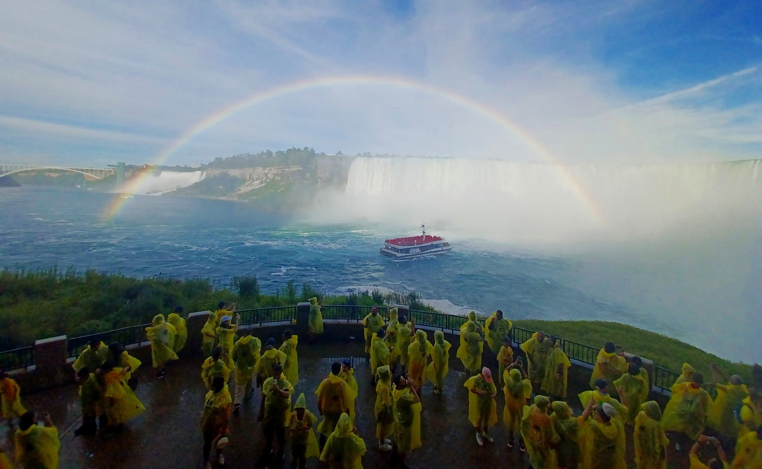
Niagara Falls, Canada: The subtle yellow of the rain jackets mirrors the yellow in the rainbow, creating a harmonious connection.
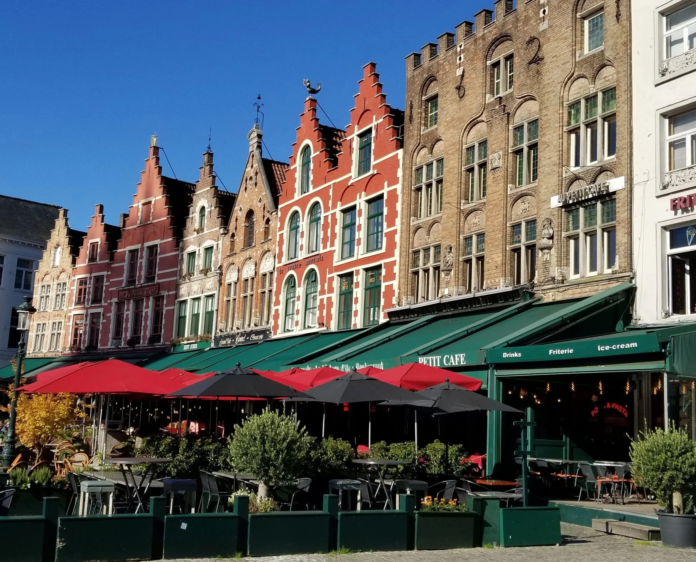
Bruges, Belgium: In this image, the red of the umbrella echoes the red of the buildings, creating a visually cohesive scene.

Vienna, Austria: The Schönbrunn Palace is captured from a unique angle, where the deep blue sky contrasts strikingly with the building’s golden yellow façade. As complementary colors on the color wheel, the blue and yellow enhance each other, creating a vivid and eye-catching image.

Rivière-Éternité, Quebec: Inside Parc national du Fjord-du-Saguenay, our bright yellow boat sits in perfect harmony with the surrounding landscape, echoing the golden hues of the changing autumn leaves and drawing the eye to the season’s vibrant transformation.
Great Job on Composition!
Be sure to move on to the Lighting Principles Page.
“I try to apply colors like words that shape poems, like notes that shape music.”